I joined YouView at the start of the creation of its next-generation set-top-box software. As a design team we had to design a new system that was robust, flexible, familiar and contemporary.
Before we start, here's a few terms you'll need to know:
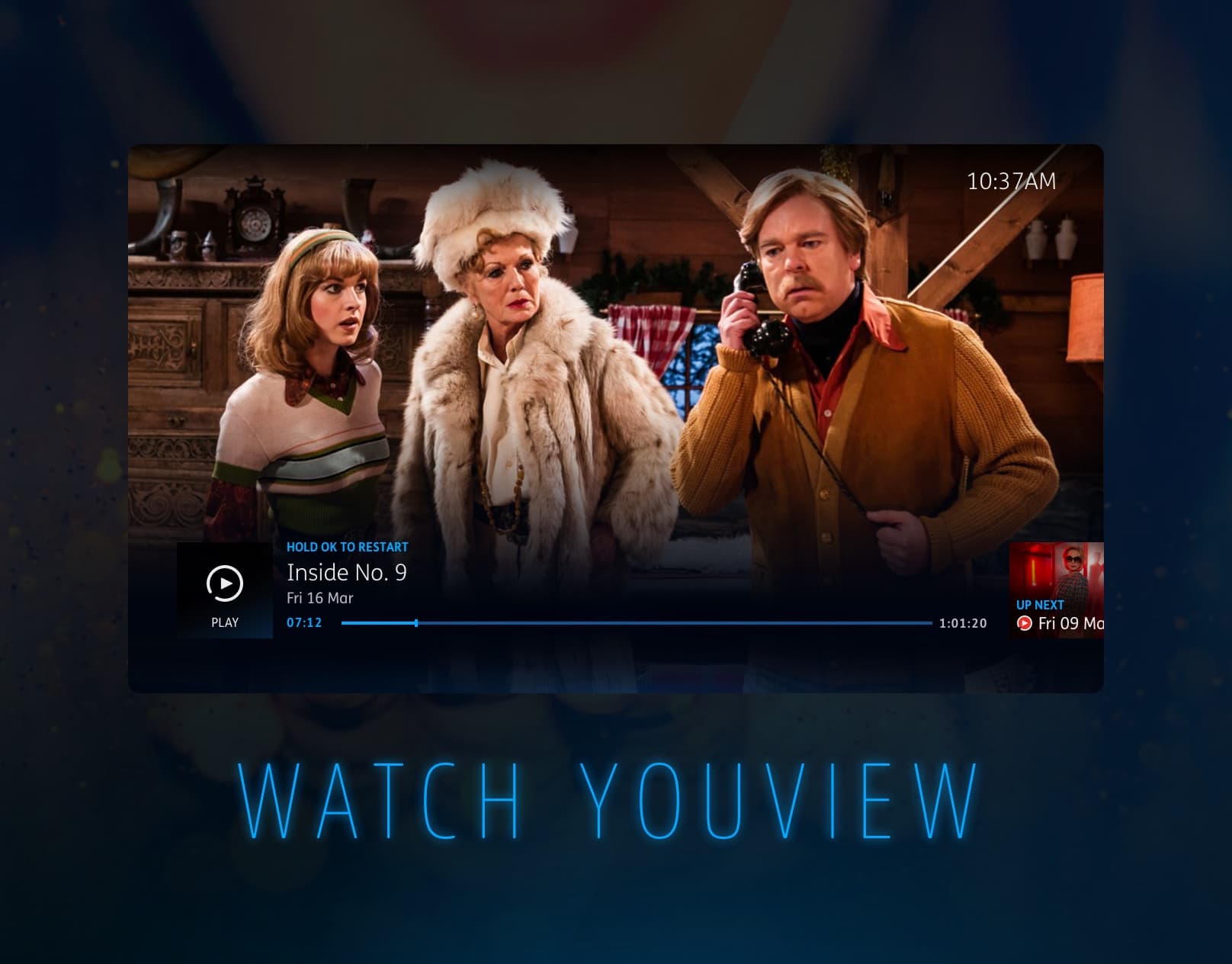
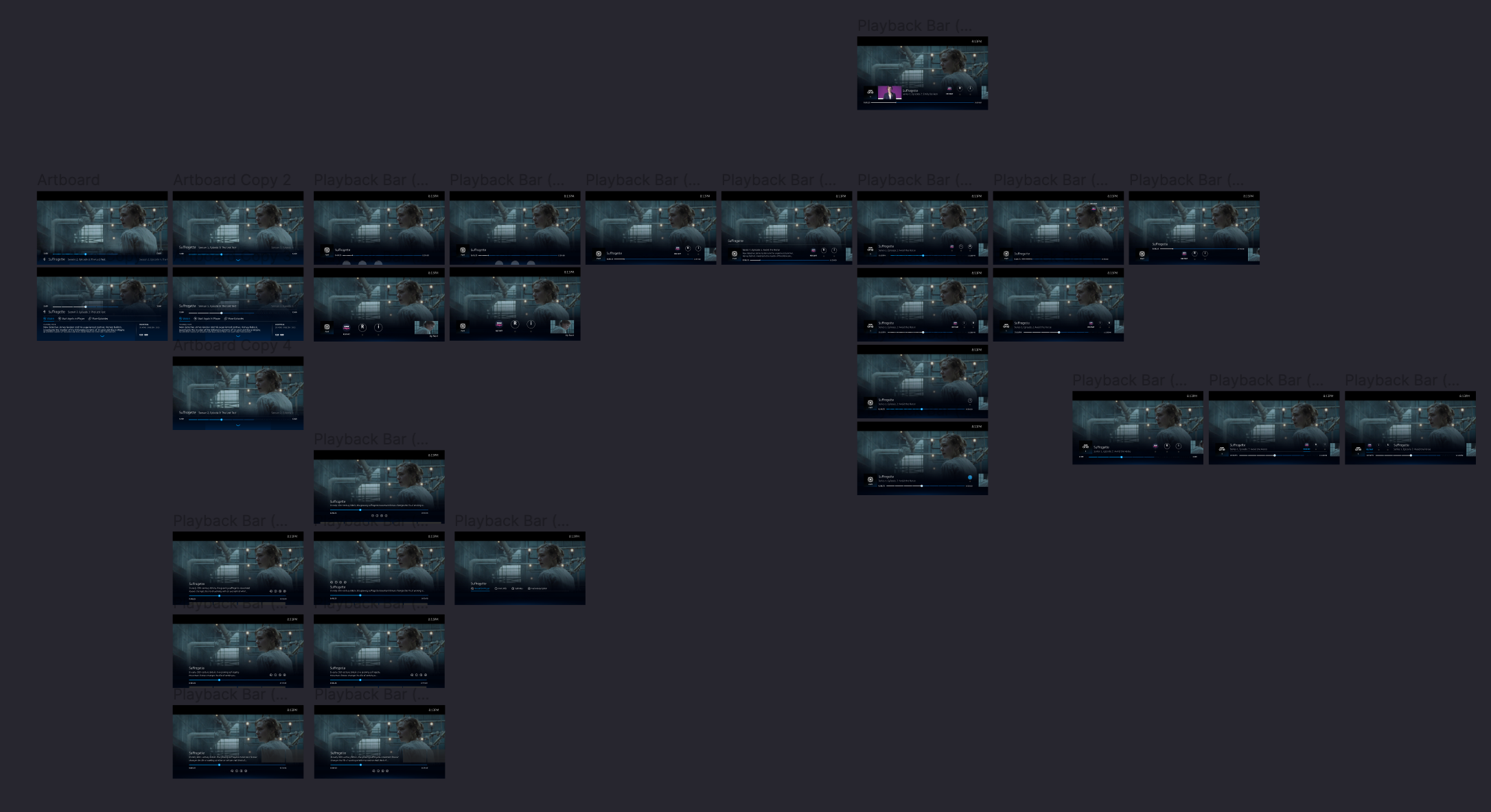
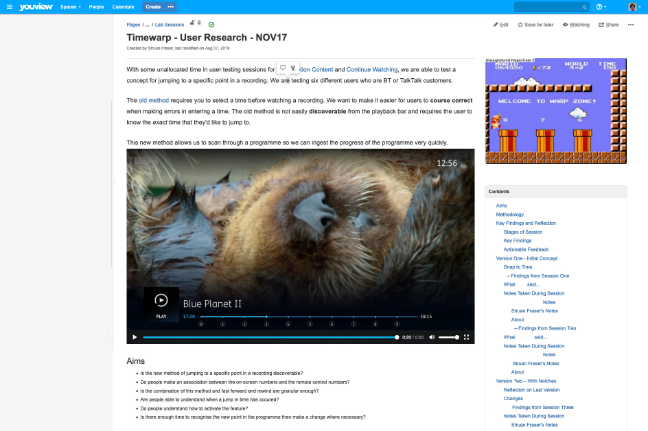
- Playback bar
- The bar that appears on the screen to show you information about the currently playing programme (pictured above)
- Trickplay
- Rewinding, fast-forwarding, pausing and skipping while watching a programme
- Recordings
- Programmes recorded from live TV
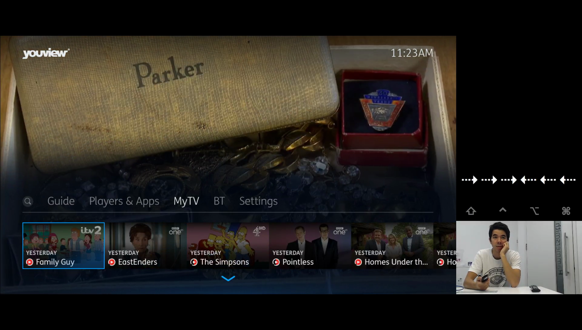
- MyView
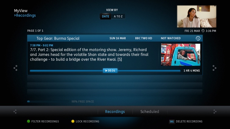
- The old area of the set-top box software where you would choose to play a recording
- MyTV
- The new area of the set-top box software where you would choose to play a recording
- D-Pad
- The arrow keys on your remote control used to navigate the system
Introduction
Playback is the core of the set-top box experience and we aimed to allow people to watch programmes as quickly as possible. With the YouView set-top box you can watch live TV, recordings and livestreams which all feature the playback bar. Live TV is the first thing you see when you switch on the set-top box so it's important that navigating from there is clear and comprehensible. Playback should obscure the video feed as little as possible while offering clear affordances for trickplay options when they are available.
My role
At YouView we all participated in designing the whole system but each member of the design team was asked to lead within different clusters. When I was appointed to the playback bar, I was responsible for programme restart, the secondary title, end of playback, play next episode and d-pad trickplay. As a part of this role, I sat in on all of the cluster meetings to help us negotiate a position from the perspective of different kinds of user. Doing this has helped me develop a much stronger intuition for how to break down and deliver features and know when they're ready for release.
Trickplay
Our process varied between projects depending on the needs of the subject. In order to demonstrate some of the steps we took in one particular case, I'm going to summarise the process of designing trickplay within the playback bar. As the design process is always a little messy and non-linear, I won't tell the whole story but if you want to know more, I'll be happy to get into the nitty gritty.
Old feature
When we launched YouView's next generation software, we didn't have all of the features that were in the old software. We previously had a feature where you could type in the specific time to which you have watched (pictured below). The time had to be typed in before watching the recording. When people tried it we found that after making a mistake, navigating to course correct could take a lot of time. It was clear that we needed to afford the ability to jump through the programme while watching a recording. This feature was limited to recordings but we sought to find a way to navigate through a programme whether it's live, recorded or on demand in order to create a more coherent, learnable means of navigation.
Wimbledon
We noticed that there were many more requests for the old feature when sports events were on because people had long recordings that were unwieldy to navigate using fast forward alone. Even at 64x the speed, it took a long time to navigate through six hours of broadcasting which was corroborated in interviews. This became a fairly reliable use case that we could test the product against and a criteria through which we could recruit users.
Previous research
When we first started building the next-generation software, I had a chance to sit-in on usability testing of the playback bar prototypes. Another member of my team was leading UX in the cluster at the time. We'd designed research featuring a series of tasks we could analyse. The research was conducted by an external agency which we sat in on.
We'd learned some key things that were relevant to trickplay. People usually use the video feed instead of the playhead to figure out where they are in a programme. This means feedback around the playhead – the active element – is unlikely to be seen. We rely on the events and images of the programme to orient ourselves in time. For example, we're much more likely to remember "Ashleigh lost her watch" than "I was 8 minutes into the programme". With the old feature we were relying on people remembering the duration they'd watched rather than recognising the scene they were on.
Remote controls famously have an unwieldy number of buttons. When trying to navigate through a programme, people would often try and use the d-pad rather than the dedicated fast forward or rewind buttons. The number of buttons made task completion take longer than expected when considering Hick's Law. We aimed to make navigation possible using the d-pad and the context of the interface at that moment in time. This wasn't always possible for many reasons but that's a longer, different story.
Early concepts
Having spoken to some of the users who were loudly asking for this feature, we were able to figure out some primary use cases. One was trying to navigate very long sports programmes and the other was that the progress in the programme had been lost or watched somewhere else.
As I'm telling this in retrospect. I hadn't collated all of this information by the time I'd started concepting so you'll see some of the ideas I had to work through before fully understanding the problem.
One of the first concepts that appeared came from one of our developers who had built a concept that we could go forward with. It worked but it had no affordances to signal how to use it. Unfortunately they didn't have time to help me flesh out this idea further so I decided to develop a prototype framework myself.
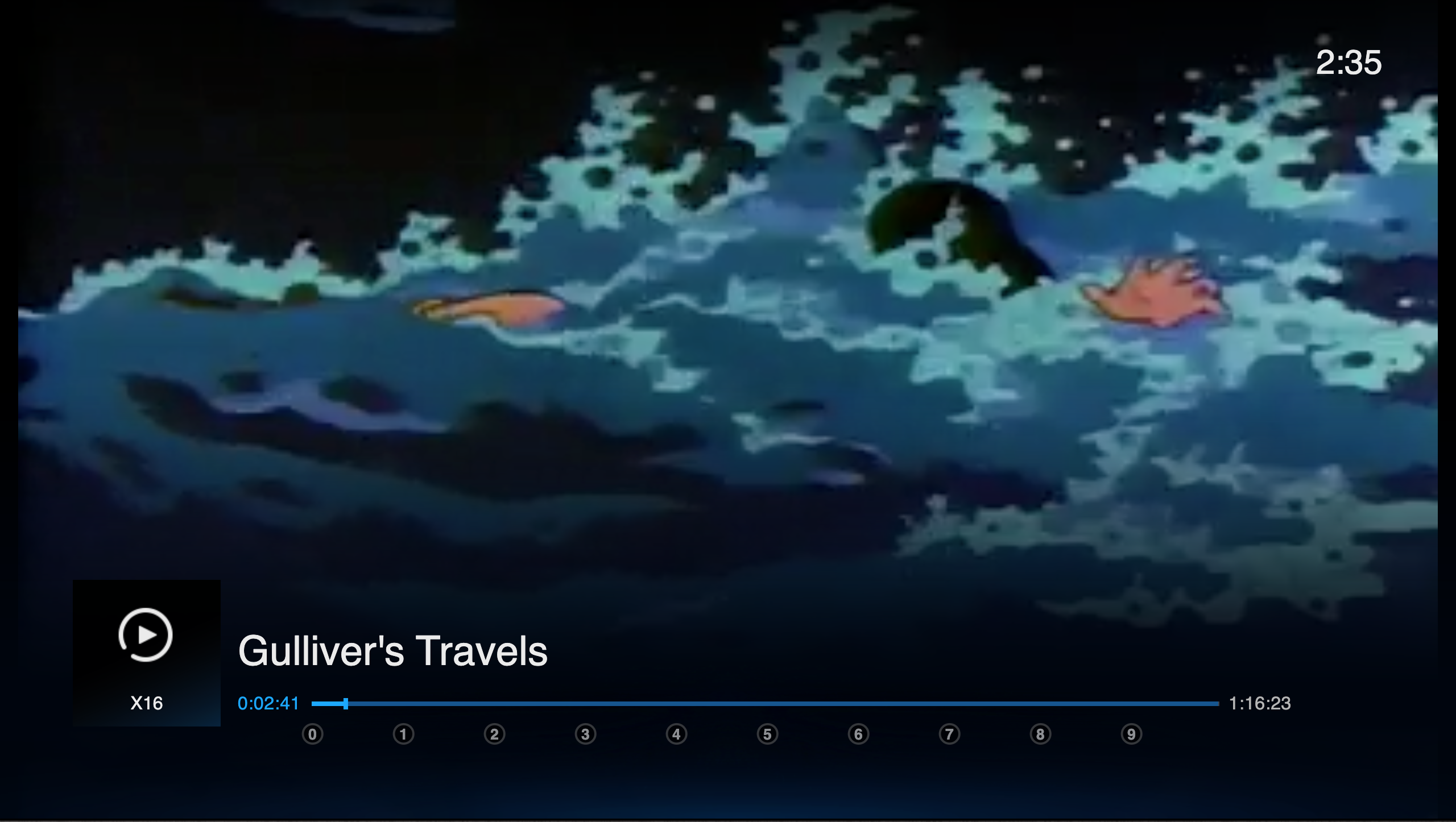
The following is a recreation of that prototype. This was made using Framer Classic and all of the following prototypes are drafts designed to provoke a reaction, not to be a final design comp. They also tend to be a little glitchy but working perfectly is not the point. When testing it, we use a FLIRC controller to convert remote control input into keyboard input. In the prototype, type a number in whole minutes that is less than the duration of the film.
After putting this in front of people, I noticed that they would pause to think about where they were in the programme before comitting to pressing a button. Here are some of the things people were saying when I asked what people were thinking:
Well I was about half way through, so I was looking at how long the programme was (30 minutes) and typing 15
I was changing an hour and 23 minutes into whole minutes which takes a second to work out
People were also typing in several numbers because they were looking for a particular scene. When asked, it went a bit like this:
- *Types in 45*
- Ah I haven't seen this bit yet, I need to go back
- *Types in 30*
- Okay, I've seen this
- *Presses fast forward until they've found the point they have not yet seen*
One of the first things I chose to tackle was the changing from hours to minutes. I tried to create a prototype that figured out whether you were typing in hours or minutes based on the event and the number of digits you type. For long events this is important because three hours and 12 minutes can be difficult to translate to whole minutes. The reaction was similar to the previous prototype and people seemed to understand it but I still wasn't happy with it.
From these tests I was starting to think that what we were doing was essentially building a bookmark tool but without the bookmark. You have to remember the time you've progressed through a programme: this could be handled by the system. To me this was a signal that the model was wrong and we were relying on recall rather than recognition. If people were going back and forth in the programme, you shouldn't have to press several buttons to quickly scan through it.
Getting closer
Our ambition was to use the d-pad to navigate the system but we already had lateral movement in the playback bar as that's how you navigate to the next episode.
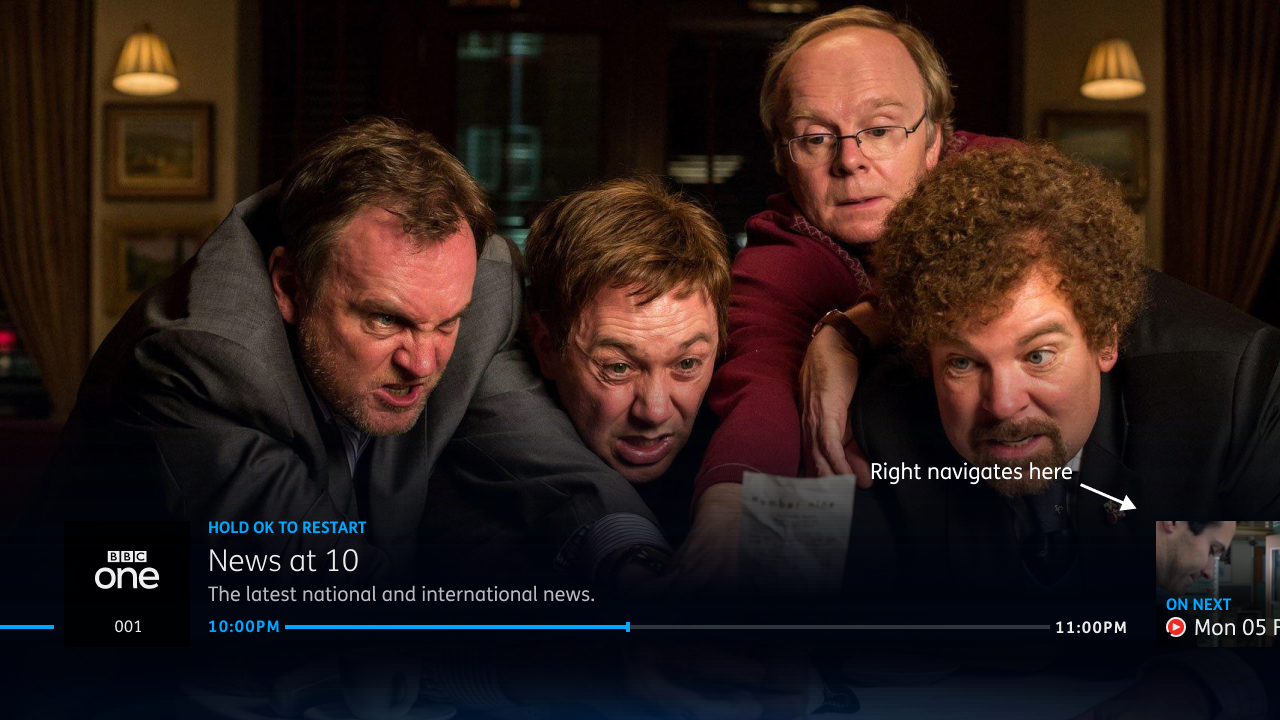
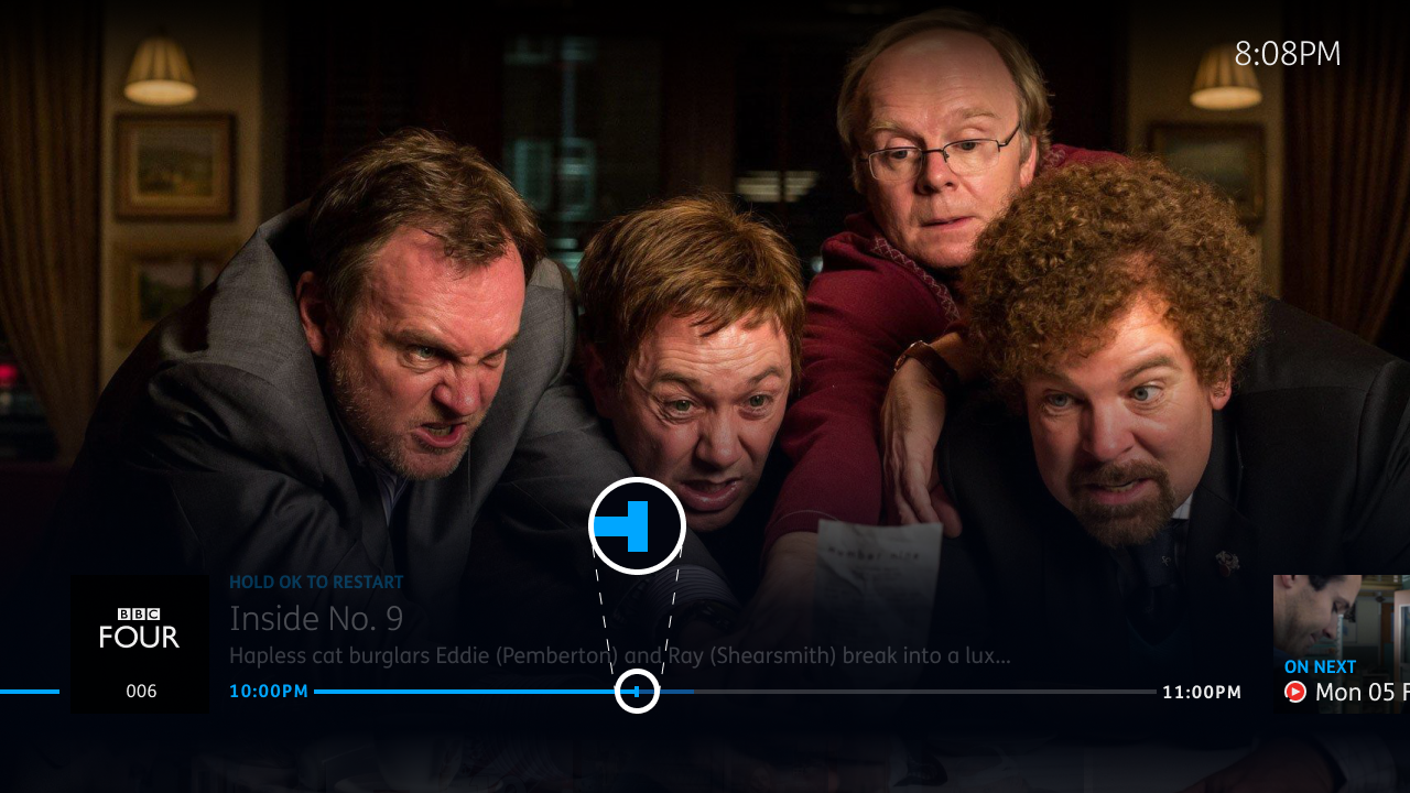
For the time being, we couldn't use the d-pad for fast forward and rewind. However the playback bar has several states. When using trickplay the next episode is no longer available. I wanted to create some kind of affordance that showed you can jump longer distances once you're in a trickplay state.
I decided that we should only show the affordance for a long jump once fast-forward is used as that shows an intention to navigate the programme.
Rapid iterative testing
During the testing of the playback bar, I helped introduce Rapid Iterative Testing and Evaluation (RITE) which was not previously possible. Having a high fidelity prototyping framework meant we could respond to feedback much more quickly. The research was designed to ask people to find a specific scene in a programme. We tested with 3 popular programmes: Planet Earth, Strictly Come Dancing and The Apprentice. For each we asked them to find: Planet Earth's behind the scenes section, the scoring for Strictly and the boardroom section of The Apprentice. They could choose the programme they were most familiar with.
This allowed us to determine if the association of visual affordances to functionality was clear and that people could orient themself within a programme. I made many small changes during these sessions. These included:
- Animating the playhead to make the change in time clearer
- Changing the video feed at the end of the playhead animation to associate the animation with the time change
- Animating the selected number to jump to
This was extremely successful and the feedback was invaluable in making small improvements that made the micro-interactions feel tighter and more direct.
Accessibility
I had some concerns that the animation involved in the interaction could be a problem for those with vestibular disorders. The transient nature of the interaction could also make it difficult to complete the action in the alloted time. To give room for decision-making, we used similar timeouts that we'd used in other areas of the system that had been tested with the Royal National Institute of Blind People.
Alongside this, the feature is designed with the expectation that mistakes will be made and can be easily corrected so this should reduce decision making time. We also made sure to allow for use of the feature with Grid 2 and Alexa to allow for use of other input devices. These are not constrained by the same timeout problems and are used mostly independently of the set-top box interface.
Documentation
Our work was documented on our collective wiki but working with and next to the development team meant we could collaborate in order to understand where and how we were making trade-offs. This was important for planning future sprints and understanding the development cost of each of the constituent elements of the feature.
In this case, I showed videos of the various iterations with downloadable copies of the prototypes. This was documented next to findings from the research sessions. We used this as a discussion point for cluster meetings. One of our listed key-aims was to reduce the time people spent using trickplay to allow them to watch TV uninterrupted.
Delivery & reception
When planning how we would sequence the delivery of the feature, we decided to release it before adding any of the visual affordances and it now worked without having to use trickplay first. When it was released, some people using the feature thought it was strange and hard to understand.
We often discussed people's expectations from the old software and how changes can be confusing. In this case I think we had to wait until we had visual affordances before releasing the feature. In the planning process, I became too enthused about releasing the feature and it sounded like it would be a long time before it was planned for delivery so I agreed to releasing it in a smaller form. If I had to do this again, I would show the value this feature has in relation to other major projects with our business partners and how it would impact their customers. I don't think we communicated the value of the full feature well enough to ensure that it was delivered in a complete form.
That being said, it does allow people to do what it was intended to do and people are now using it to jump through those long sports programmes and get to their favourite TV scenes. People are spending less time in trickplay and enjoying their TV recordings.